shrimp.vijf.life
Instance
Federation
Login
shrimp.vijf.life
Instance
Federation
shrimp.vijf.life
Instance
Federation
Login
Jan Wildeboer 😷
@jwildeboer
@social.wildeboer.net
1mo
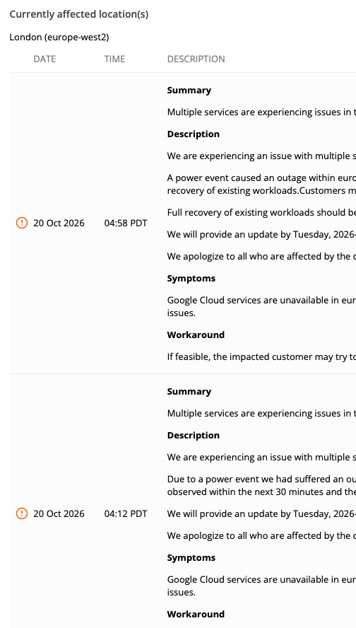
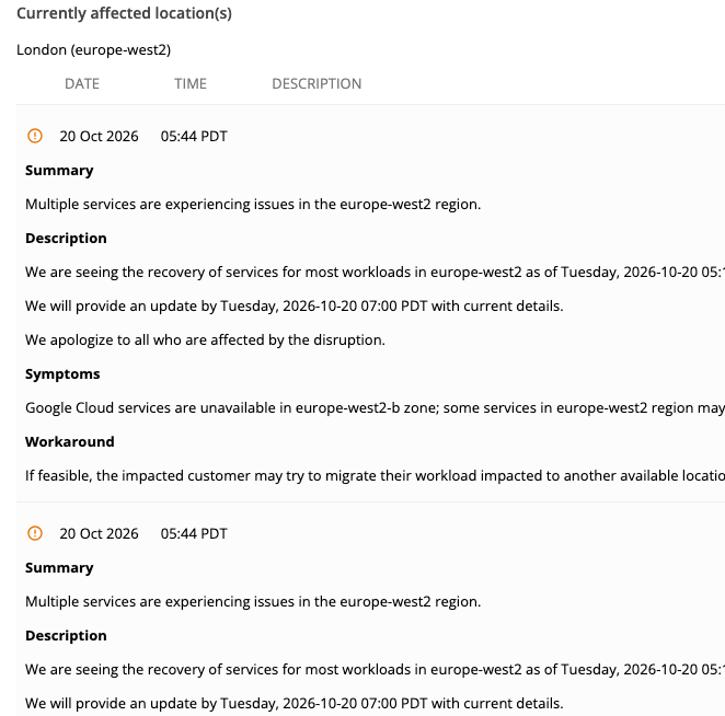
Dear web designers. Don't be like Google. Vertical center align for table rows is confusing and breaks the reading flow. Align to the top. Always. Also: low contrast row separation adds to the insult.Thank you for your valuable time.
(This is the Google Cloud status page, showing a major outage in the europe-west-2 zone
status.cloud.google.com/incidents/Xs2XTHzAVC9YnafnPyzj
;)
6
0
0
0
Dennis Koch
@denniskoch
@phpc.social
1mo
@jwildeboer
Also: tables on mobile suck. Make them stack if it makes sense.
1
0
0
0
sijmen
@sijmen
@shrimp.vijf.life
1mo
@denniskoch
@jwildeboer
Agree, this shouldn't have been a table in the first place
0
0
1
0